Pandas is a well known Python framework for Data Scientists. It is used to process large sets of data to derive statistics, perform grouping, and create meaningful visualizations. As data processing is becoming prevalent in IT, Pandas offers a versatile tool for the day to day operations of a Network Engineer. In this post, we will review the basics of Pandas by exploring real world networking examples.
There are numerous blogs and excellent documentation for the Pandas framework. My goal is to give a different perspective as a Network Automation Engineer that has dealt with data processing for various use cases, such as network security data and time series monitoring. This post is a first of a series that will show you how you can infuse data analytics in your day to day work for network operations and automation. If you want to follow this post interactively using a Jupyter notebook all the code and datasets can be found in this Github repository.
Below, you will find specific reasons why you should care about Pandas:
Python Pandas is a rich framework that includes data models, mathematical functions, and visualizations, with a goal to make data processing efficient and simple. Some of the most powerful features of the Pandas framework are listed below:
In the rest of this blog, you will review these concepts with a network packet capture use case. The data set I am using is from the Kitsune Network Attack Dataset. I chose a packet capture (pcap) of the Mirai botnet. Mirai is a Distributed Denial of Service (DDoS) botnet attack that used vulnerable Internet of Things (IoT) devices to take down Domain Name Service (DNS) servers. As a consequence, Mirai disrupted the services of high profile sites such as Amazon and Reddit. There is an interesting story behind the dataset and it can demonstrate how a network engineer can be part of a solution to such network attacks.
Data modeling is dear to the heart of a Network Automation Engineer because it standardizes the way we use Infrastructure as Code (IaS). Data modeling with Pandas aims at organizing and abstracting data for efficient processing.
Series are arrays of a single dimension, i.e., single column multiple row arrays. The main characteristic of a series is that it has an index which can be labels, numbers, timestamps etc.
Let’s look at an example of a series with default index increasing numbers. We first export the packet capture to the file Mirai.csv. The code imports the required libraries and then reads the csv file using the pandas library read_csv:
import numpy as np
import pandas as pd

mirai_data = pd.read_csv("../data/Mirai.csv")
This is a pretty large file and part of the output is shown below:
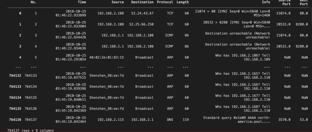
Now let’s look at a Series data structure:
mirai_series = mirai_data["Source"]
type(mirai_series)
Below you can see what the series looks like and the type of the object:
0             192.168.2.108
1             192.168.2.108
2               192.168.2.1
3               192.168.2.1
4         48:02:2e:01:83:15
                ...
764132    Shenzhen_98:ee:fd
764133    Shenzhen_98:ee:fd
764134    Shenzhen_98:ee:fd
764135    Shenzhen_98:ee:fd
764136        192.168.2.115
Name: Source, Length: 764137, dtype: object

pandas.core.series.Series
Note that the column is indexed automatically from the Pandas framework with increasing numbers.
There is a variety of operations that you can perform and Series attributes to use according to the documentation. Let’s review some here:
mirai_series.is_unique: returns False in our case since we have duplicate IPs in this Series.mirai_series.index, returns dimensions of the Series: RangeIndex(start=0, stop=764137, step=1).mirai_series.hasnans, returns False in our case since we have duplicate IPs in this Series.mirai_series.to_list(): transforms a Series to a list.mirai_series.copy(): performs deep copy of your Series.These attributes and functions are useful when you are trying to format or just “get to know” your data or convert it to a different data structure. You will review functions for statistical analysis and visualization in following subsections.
In contrast to the Series, a Data Frame has two dimensions. This is a labeled data structure that may include different types of data. It is similar to a spreadsheet or an SQL table. Let’s consider again the Mirai data set. If you print the type of the object returned by the function read_csv, you will find out that it is a Data Frame:
import numpy as np
import pandas as pd

mirai_data = pd.read_csv("../data/Mirai.csv")
print(type(mirai_data))
pandas.core.frame.DataFrame
As you have probably suspected, a Data Frame is composed by a labeled list of Series. Each Series represents a column of the data set and in the case of our csv the labels are defined in the top row of the file. If you look at the Data Frame documentation there is a wealth of attributes and functions. Let’s look at some useful attributes:
mirai_data.values: gives an array of values, i.e., all the records of your data frame:array([[1, '2018-10-25 01:46:22.933899', '192.168.2.108', ...,
'21074 > 80 [SYN] Seq=0 Win=5840 Len=0 MSS=1460', 21074.0,
80.0],
[2, '2018-10-25 01:46:22.933904', '192.168.2.108', ...,
'20532 > 8280 [SYN] Seq=0 Win=5840 Len=0 MSS=1460', 20532.0,
8280.0],
[3, '2018-10-25 01:46:22.934426', '192.168.2.1', ...,
'Destination unreachable (Network unreachable)', 21074.0, 80.0],
...,
[764135, '2018-10-25 03:45:19.840611', 'Shenzhen_98:ee:fd', ...,
'Who has 192.168.2.167? Tell 192.168.2.110', nan, nan],
[764136, '2018-10-25 03:45:19.842369', 'Shenzhen_98:ee:fd', ...,
'Who has 192.168.2.168? Tell 192.168.2.110', nan, nan],
[764137, '2018-10-25 03:45:19.842464', '192.168.2.115', ...,
'Standard query 0x1e08 AAAA north-america.pool.ntp.org.Speedport_W_724V_01011603_00_005',
3570.0, 53.0]], dtype=object)
mirai_data.shape: gives you the dimensions of the data frame in the format (number of rows, number of columns) which in the case of the mirai_data is: (764137, 9).In the next subsections we will review more Series and Data Frame functions for indexing, grouping, and statistical processing.
Indexing refers to segmenting data and viewing it in pieces. The Pandas framework offers a variety of indexing mechanisms.
The following example gives the first three rows of the Data Frame:
mirai_data[0:3]

We can apply this to a Series as well:
mirai_series[0:3]
0    192.168.2.108
1    192.168.2.108
2      192.168.2.1
Name: Source, dtype: object
Another cool way to slice the data is by using the loc function:
mirai_data.loc[:, ["Time", "Source Port"]]
	                    Time	Source Port
0	2018-10-25 01:46:22.933899	21074.0
1	2018-10-25 01:46:22.933904	20532.0
2	2018-10-25 01:46:22.934426	21074.0
3	2018-10-25 01:46:22.934636	20532.0
4	2018-10-25 01:46:23.291054	NaN
...	...	...
764132	2018-10-25 03:45:19.837515	NaN
764133	2018-10-25 03:45:19.839396	NaN
764134	2018-10-25 03:45:19.840611	NaN
764135	2018-10-25 03:45:19.842369	NaN
764136	2018-10-25 03:45:19.842464	3570.0
764137 rows × 2 columns
We just sliced the data by Time and Source Port. The same function can be applied to a Series data structure as you have probably already guessed.
What if we want to get our data at a specific position? For this, Pandas offers the iloc function again applicable to Data Frames and Series data structures.
mirai_data.iloc[3]
No.                                                        4
Time                              2018-10-25 01:46:22.934636
Source                                           192.168.2.1
Destination                                    192.168.2.108
Protocol                                                ICMP
Length                                                    86
Info           Destination unreachable (Network unreachable)
Source Port                                          20532.0
Dest Port                                             8280.0
Name: 3, dtype: object
In this case we visualize the record, i.e., row, 3, with all its labels, i.e., columns.
Another example of slicing is getting a specific set of rows and columns as seen below:
mirai_data.iloc[10:20, [2, 7, 3, 8]]
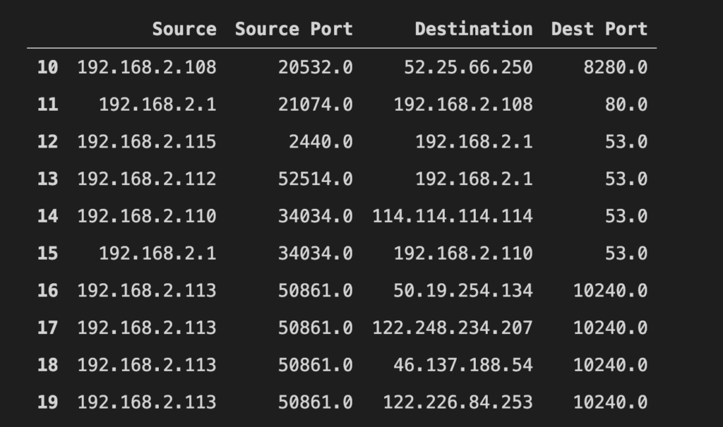
That gives us a good visual of source/destination IPs and ports. Note that you can change the order of your columns to make better sense of your data.
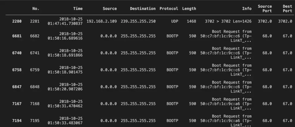
One of my favorite indexing mechanisms is to perform boolean operations. What if you want to look for unusually large packets? You can perform this operation with a single line of code:
mirai_data[mirai_data["Length"] > 512]
Grouping is a way to combine data for further processing. For example, we can group the packets by source IP to calculate the total number of bytes sent from a specific IP:
mirai_data.groupby("Source").sum()["Length"]
Source                          Length
0.0.0.0                         13108
00:ec:04:56:93:03               19860
192.168.2.1                   3721863
192.168.2.101                  627282
192.168.2.103                   98271
192.168.2.104                  381972
192.168.2.105                   33252
192.168.2.107                  116031
48:02:2e:01:83:15              120720
ASDElect_3a:eb:e8               16980
Arcadyan_c6:12:7b              207720
Cisco_28:d6:06                 302556
D-LinkIn_db:4a:e2                7620
Espressi_05:f2:c6               10980
Fn-LinkT_e0:fc:c9               22680
Foxconn_d5:63:5c                 3240
Giga-Byt_4b:99:14                4260
...
Or you can group by more than one labels, for example source and destination port to show that specific sources are targeting specific ports:
mirai_data.groupby(["Source", "Dest Port"]).sum()["Length"]
Source                     Dest Port     Length
0.0.0.0                    67           13108
192.168.2.1                53           736284
                           68           48944
                           80           711354
                           123          14396
                                         ...
192.168.2.196              123           2700
                           51009        84660
fe80::203b:a22a:5501:5006  5355           688
                           8083            83
fe80::f014:8275:ad82:d005  5353           214
Name: Length, Length: 3757, dtype: int64
An interesting observation is that by using this simple calculation we note that port 53 is being used extensively as a destination. Since DNS was part of Mirai’s attack vector our data proves this.
Now let’s get to the real fun stuff. Statistics without pain!
The functions describe() is an easy way to get descriptive statistics for all your data, such as count, mean, standard deviation, percentiles, minimum, and maximum values:
mirai_data.describe()
               No.	    Length	  Source Port	    Dest Port
count	764137.000000	764137.000000	18236.000000	18236.000000
mean	382069.000000	66.262442	    33065.793387	6482.248240
std	  220587.495661	19.751378	    18483.721156	7596.797988
min	  1.000000	    42.000000	    0.000000	    23.000000
25%	  191035.000000	60.000000	    21897.000000	53.000000
50%	  382069.000000	60.000000	    32761.000000	8080.000000
75%	  573103.000000	60.000000	    50861.000000	10240.000000
max	  764137.000000	1468.000000	  65267.000000	65267.000000
Note that the operation is performed only on the columns that are considered numbers, such as increasing number, length, and ports and not the IPs. Obviously these statistics do not have a meaning for ports and increasing packet numbers, however there is still a quick way to count how many different ports (count), the min and max port number.
Of course, you can perform statistical functions on specific series that include only numbers:
mirai_data["Length"].cumsum()
0               60
1              120
2              206
3              292
4              352
            ...
764132    50633285
764133    50633345
764134    50633405
764135    50633465
764136    50633584
Name: Length, Length: 764137, dtype: int64
Cumulative sum is useful to see how fast the packet length is growing, but better perform it grouped by meaningful features for the network, such as the source and destination IPs, right?
mirai_data.groupby(["Source", "Destination"]).cumsum()["Length"]
0               60
1               60
2               86
3              172
4               60
            ...
764132    33088080
764133    33088140
764134    33088200
764135    33088260
764136     1199342
Name: Length, Length: 764137, dtype: int64
Discretizing your packet captures is useful for calculations or visualization. Pandas offers a simple function, value_counts to create histograms. A histogram is a representation of your data that uses buckets, i.e., value ranges, to count the number of values in your data set that fit in these buckets. If you had to write the code to create a histogram, you would have to perform the following steps:
range of values. If the values were ports, the range would be (1...65536).[1,2), [2,3), ..., [65535, 65536) and the [ indicates that the value should be greater than or equal, whereas the ) indicates that the value should be less than.1, 2, …, 65536 appear in your data.All these steps can be performed in a single line of code:
mirai_data["Dest Port"].value_counts()
10240.0    68886
53.0       40447
80.0       24915
23.0        9466
8280.0      8195
...
Again the data proves the attack vector of Mirai was aimed heavily to DNS (port 53), with telnet (port 23) being targeted as part of vulnerable IoT devices with default credentials.
You may want to do calculations with the dates in the specific pcap. Here is how you convert your timestamps to datetime objects:
timestamps = pd.to_datetime(mirai_data["Time"], format='%Y-%m-%d %H:%M:%S.%f')
In this example, we used the Series data structure that is marked with the label Time and a formatting label to convert the timestamps using the function to_datetime(). Now we can perform neat calculations, such as indexing with dates and calculating statistics:
import datetime

timestamps = pd.to_datetime(mirai_data["Time"], format='%Y-%m-%d %H:%M:%S.%f')
mirai_data["Time"] = timestamps
print("Timestamps")
print(timestamps)

ref = pd.Timestamp('2018-10-25 01:50:36.406909')
print(f"ref: {ref}")
length_std = mirai_data[mirai_data["Time"] > ref]["Length"].std()
print(f"length_std: {length_std}")
Timestamps
0        2018-10-25 01:46:22.933899
1        2018-10-25 01:46:22.933904
2        2018-10-25 01:46:22.934426
3        2018-10-25 01:46:22.934636
4        2018-10-25 01:46:23.291054
                    ...
764132   2018-10-25 03:45:19.837515
764133   2018-10-25 03:45:19.839396
764134   2018-10-25 03:45:19.840611
764135   2018-10-25 03:45:19.842369
764136   2018-10-25 03:45:19.842464
Name: Time, Length: 764137, dtype: datetime64[ns]
ref: 2018-10-25 01:50:36.406909
length_std: 19.420279817398622
The timestamps are converted to datetime64 object as you can see in the output. The variable ref is one of these timestamps, and the length_std is the standard deviation of packets that were recorded after the reference date, ref.
Time for some pretty graphs. First a graph of the length of packets of specific flows:
import matplotlib.pyplot as plt

sorted = mirai_data.groupby(["Source", "Destination"]).sum()["Length"].sort_values(ascending=False)
sorted[0:10].plot(kind='bar',alpha=0.75, rot=90, logy=True, color=['r', 'g', 'b', 'r', 'g', 'b', 'r', 'g', 'b', 'r'])
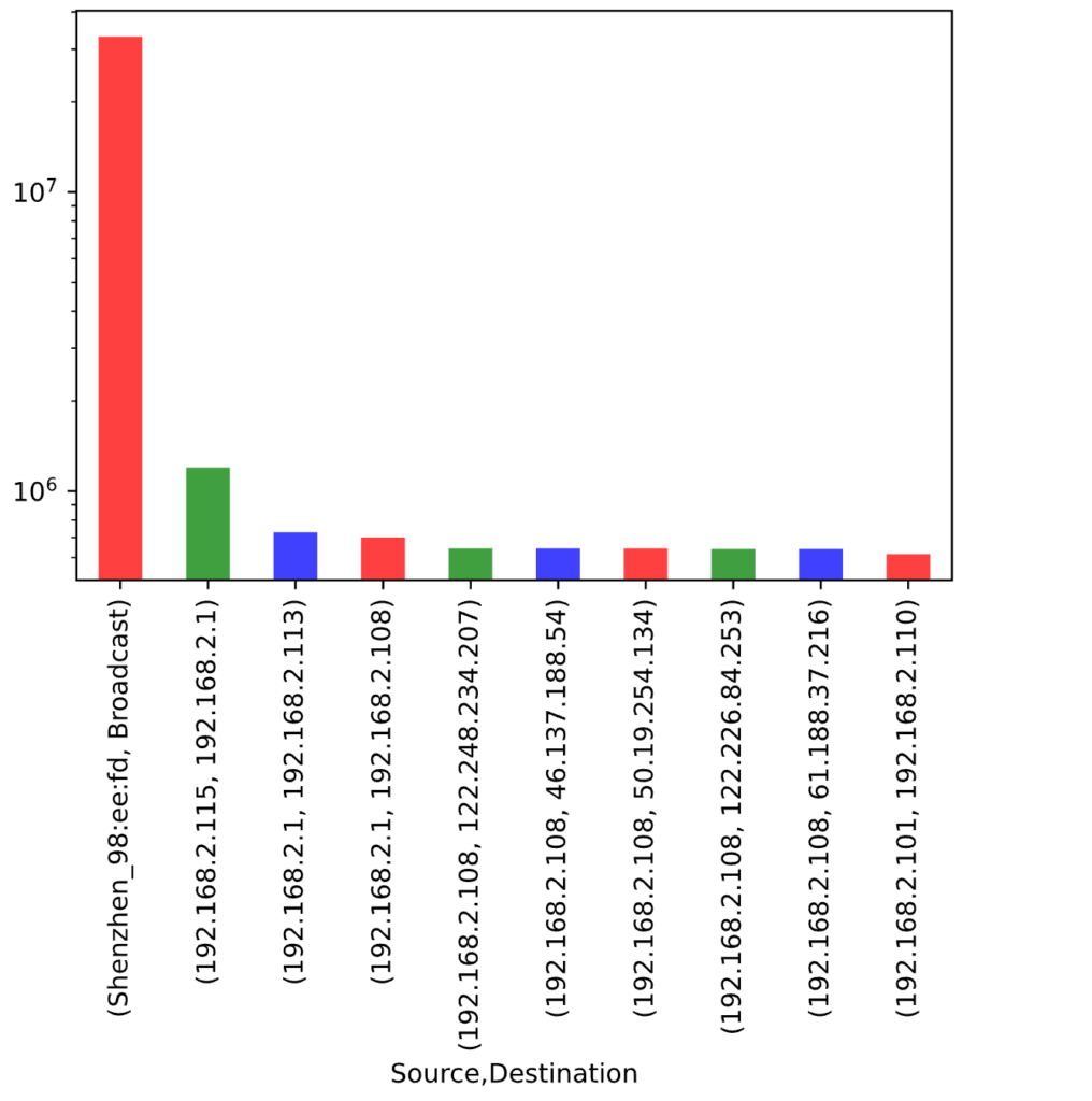
Another proof of how the Pandas framework can help you perform exploratory data analysis with cool visualizations. Here, I am plotting the total number of bytes sent by the top ten flows. The sorted variable uses functions we have already reviewed to group the data by flows and get their length, then we use the function sort_values to get these total bytes in increasing order. We plot using plot and a bar type, rotating the x axis labels by 90 degrees so that we can see the flow source and destination. As you can see, the highest flow is an outlier that throws off our plot, but no worries, we set the logy=True and we are good to go! The color property can add pretty colors to your plots.
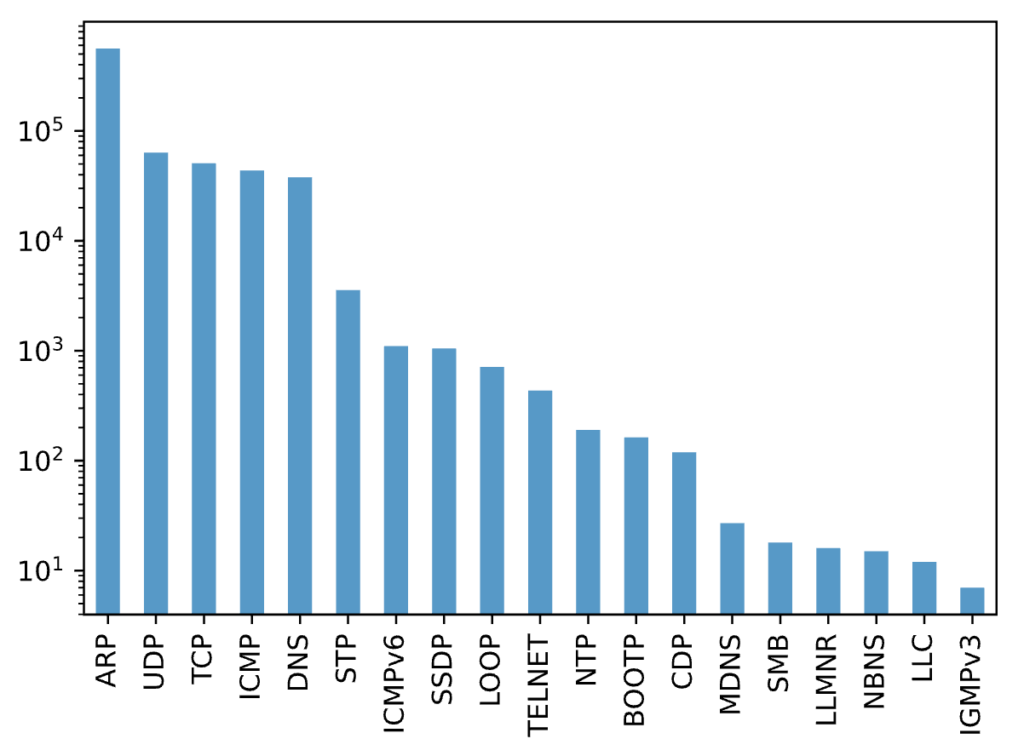
Of course, visualizing histograms can be a great guide towards discovering anomalies:
mirai_data["Protocol"].value_counts().plot(kind='bar',alpha=0.75, rot=90, logy=True)
You have had a pretty thorough introduction to a rich framework such as Python Pandas, with cool visualizations, a variety of functions and data manipulation methods. This is just the beginning, in the next two posts I will demonstrate advanced features, such as machine learning algorithms for classification and forecasting. Stay tuned!
-Xenia
Share details about yourself & someone from our team will reach out to you ASAP!