Intro to Pandas (Part 2) – Exploratory data analysis for network traffic
Data analytics is an important skill for every engineer and even more the Network Engineer that goes through large amounts of data for troubleshooting. Networking companies have been moving towards data science integrations for appliances and software. The Arista EOS Network Data Lake is a characteristic example where Artificial Intelligence and Machine Learning are used to analyze data from different resources and lead to actionable decisions.
This blog aims to develop these skills, and it is a part of a series related to data analysis for Network Engineers. The first part was a detailed introduction on how to use Pandas, a powerful Python Data Science framework, to analyze networking data. The second part included instructions on how to run the code in these blogs using Jupyter notebooks and the Poetry virtual environment. This third blog is going deeper into how we can explore black-box networking data with a powerful analysis technique, Exploratory Data Analysis (EDA). Naturally, we will be using Pandas and Jupyter notebooks in our examples.
Exploratory Data Analysis (EDA)
Exploratory Data Analysis (EDA) is an approach/philosophy for data analysis that employs a variety of statistical and graphical techniques to make sense of any type of black-box data.
Goals of EDA
EDA aims at accomplishing the following goals:
- Tailor a good fitting: Matching your data as closely as possible to a distribution described by a mathematical expression has several benefits, such as predicting the next failure in your network.
- Find outliers: Outliers are these odd data points that lie outside of a group of data. An example is a web server farm where all port requests are aimed at specific ports and every once in a while a random port is requested. An outlier may be caused by error or intentional testing and even adversarial attack behavior.
- Create a list of ranked important factors: Removing unwanted features or finding the most important ones is called
dimensionality reductionin data science terms. For example, with EDA you will be able to distinguish using statistical metrics a subset of the most important features or appliances that may affect your network performance, outages, and errors. - Discover optimal settings: How many times have you wondered how it would be if you could fine-tune your BGP timers, MTUs, or bandwidth allocation and not just guess these values? EDA helps discover the best value for networking settings.
Why EDA
EDA has been proven an invaluable tool for Data Scientists, why not for Network Engineers? We gather a lot of network data, such as packet captures, syslogs, etc., that we do not know how to make sense of or how to mine their value. Even though we use out-of-box data analytics tools, such as Splunk, the insight of the Network Engineer that stems from building a model and processing raw data, is invaluable.
How to Implement EDA
To implement EDA, you need tools that you probably use in your day-to-day network operations and did not know they were part of EDA:
- Strong graphical analysis: from single variable plots to time series, and multi-variable plots, there is a graphical tool in EDA that fits your problem.
- Statistics: this may include hypothesis testing, calculations of summary statistics, metrics for scale, and the shape of your data.
We will explore these techniques with a network dataset in the next section.
EDA for Network Data
In this section, we will review data preprocessing with graphical and statistical analysis EDA techniques.
Dataset
The dataset we will use is a 5GB packet capture of Operating System (OS) scans from the Kitsune Network Attack Dataset. You will find the code referenced below in the Pandas Blog GitHub repository.
Preprocessing
Pre-processing of the data includes cleaning and adding metadata. We will add useful metadata to our dataset.
We start with the necessary imports and reading the csv file to a Pandas data frame:
import numpy as np
import pandas as pd

os_scan_data = pd.read_csv("../data/OS_Scan_dataset.csv")
os_scan_data
That will print a subset of the data since the file is too large:
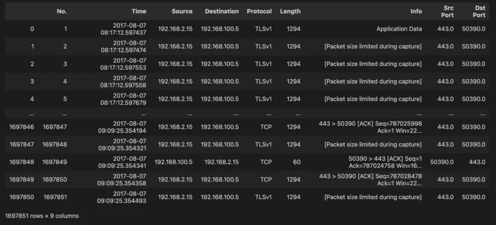
For more information about Pandas data frames, please check the Intro to Pandas blog post.
Then, we will create metadata timestamp objects using the to_datetime function:
import datetime

timestamps = pd.to_datetime(os_scan_data["Time"], format='%Y-%m-%d %H:%M:%S.%f')
os_scan_data["Time"] = timestamps
print("Timestamps")
print(timestamps)
The timestamps are shown below:
Timestamps
0         2017-08-07 08:17:12.597437
1         2017-08-07 08:17:12.597474
2         2017-08-07 08:17:12.597553
3         2017-08-07 08:17:12.597558
4         2017-08-07 08:17:12.597679
                     ...
1697846   2017-08-07 09:09:25.354194
1697847   2017-08-07 09:09:25.354321
1697848   2017-08-07 09:09:25.354341
1697849   2017-08-07 09:09:25.354358
1697850   2017-08-07 09:09:25.354493
Name: Time, Length: 1697851, dtype: datetime64[ns]
Finally, we will calculate interesting derivative data, such as the packet interarrivals. To this end, we will use the numpy function np.diff that takes as input a column of numbers and subtracts its rows in pairs:
interarrival_times = np.diff(timestamps)
interarrival_times
The packet interarrival values are printed below:
array([ 37000,  79000,   5000, ...,  20000,  17000, 135000],
      dtype='timedelta64[ns]')
We append the array to the os_scan_data type, casting it to int, and print the columns of the dataset to verify that the Interarrivals column has been appended:
interarrival_times = np.append(interarrival_times, [0])
os_scan_data["Interarrivals"] = interarrival_times.astype(int)
os_scan_data.columns
Below are the column names of our data after the preprocessing:
Index(['No.', 'Time', 'Source', 'Destination', 'Protocol', 'Length', 'Info',
       'Src Port', 'Dst Port', 'Interarrivals'],
      dtype='object')
Now we are ready to create pretty graphs!
Graphical Analysis
In this section, we will focus on two graphical techniques from EDA: histograms and scatter plots. We will demonstrate how to combine the information with jointplots to analyze black-box datasets.
Histogram
The first graph that we will make may not be pretty, however it demonstrates the value and flexibility of Pandas and graphical analysis for data exploration:
os_scan_data.hist(column=["Length", "Interarrivals", "Src Port", "Dst Port"])
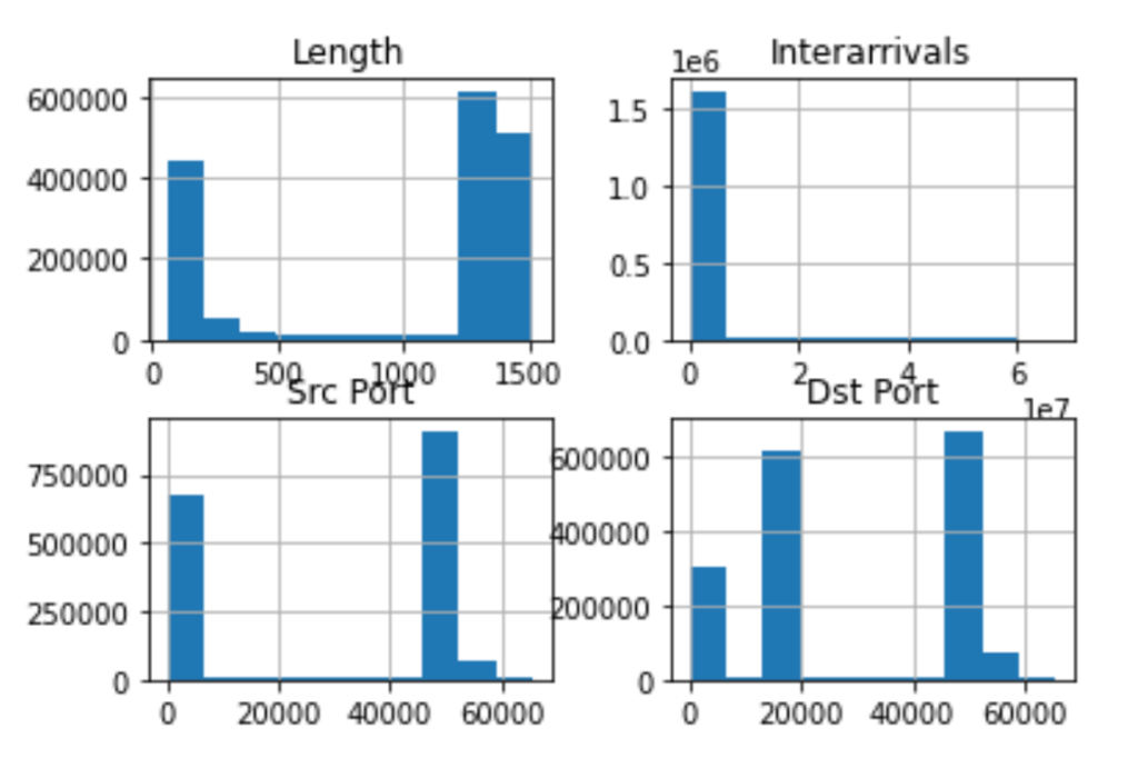
With a single line of code and the power of Pandas data frames, we already have a set of meaningful plots. The histogram offers a graphical summary of the distribution of a single variable dataset. In the above histograms, we see how the values of Length, Interarrivals, Src Port, and Dst Port are distributed, i.e., spread, into a continuous interval of values.
Histograms offer an insight to the shape of our data and they can be fine tuned to give us a better point of view. The main “ingredient” of the histogram is a bin; a bin corresponds to the bars that you see in the graphs above and its height indicates the number of elements that fall within a range of values. The default size of bins in the data frame hist function is 10. For example, a bin of size (width) 10 and height 1000 indicates that there are 1000 values x within the range: 0 <= x < 10. Modifying the bin size is a powerful technique to get additional granularity or a “big picture” view of the data distribution:
os_scan_data.hist(column='Length', bins=20)
os_scan_data.hist(column='Length', bins=100)
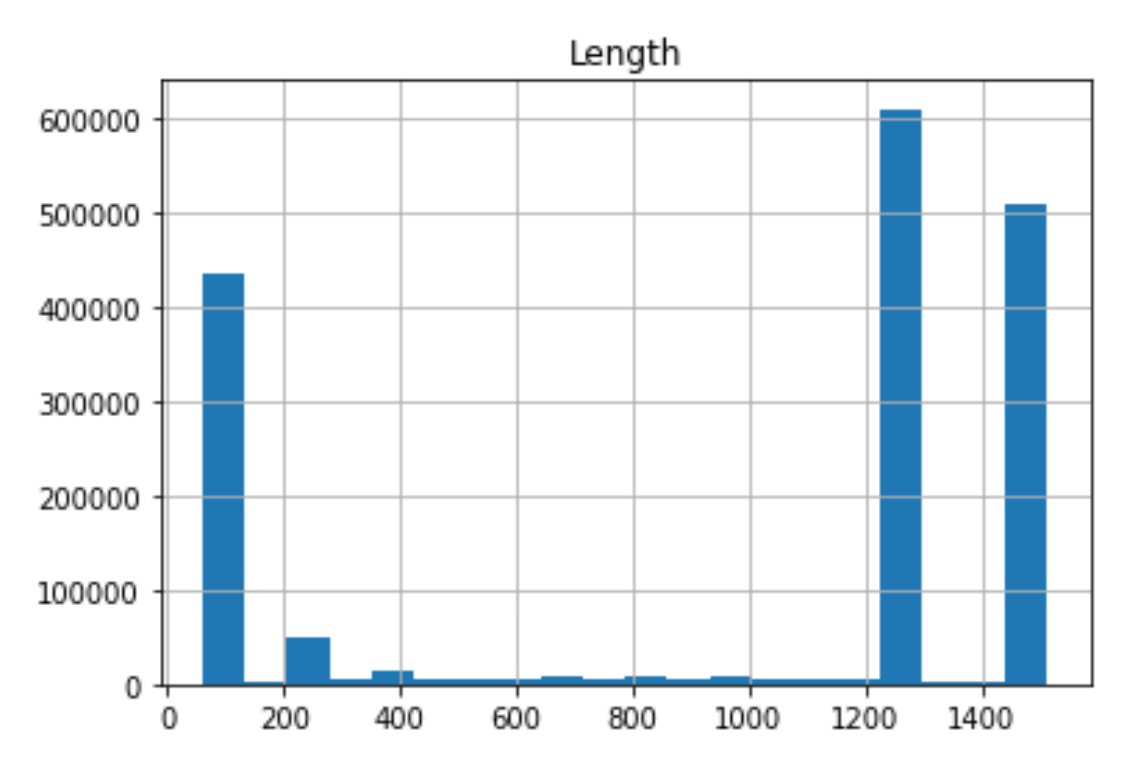 | 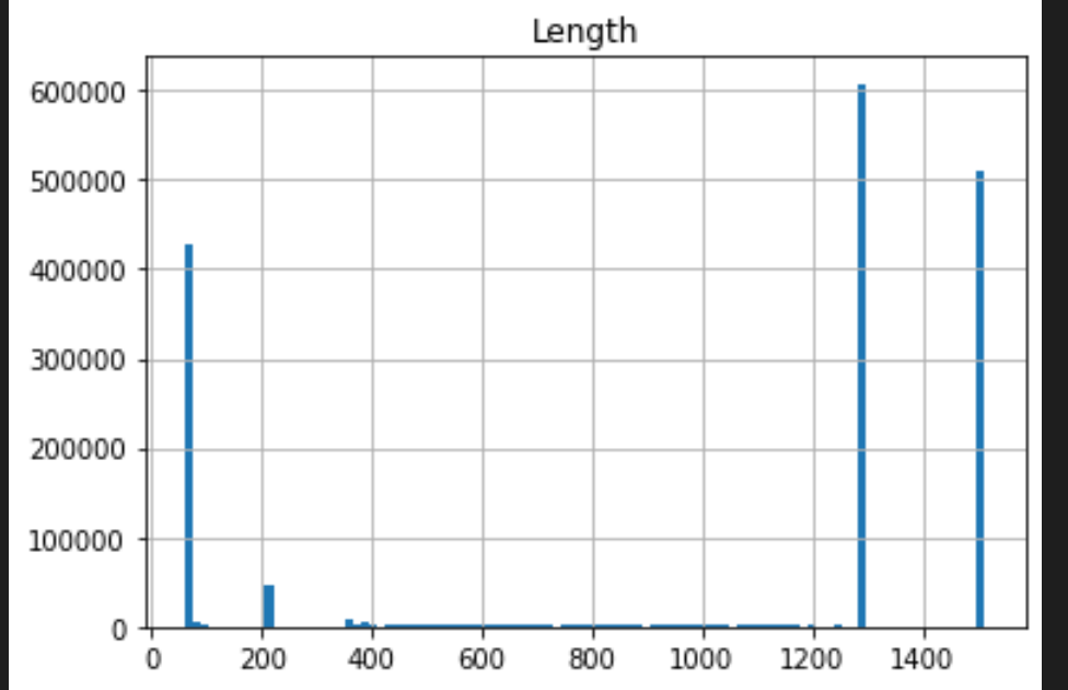 |
There is a whole science in how to fine-tune a histogram’s bin size. A good rule of thumb is that if you have dense data, a large size will give you a good “bird’s-eye view”. In the case of packet lengths, we have sparse of data. Therefore, the smaller bin helps us distinguish the data shape.
Scatter Plot
A scatter plot is another common graphical tool of EDA. Using a scatter plot, we are plotting two variables against each other with the goal of correlating their values:
os_scan_data.plot.scatter(x='Interarrivals', y='Src Port')
os_scan_data.plot.scatter(x='Interarrivals', y='Dst Port')
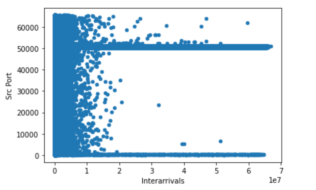 |  |
The story narrated by these two graphs is that packet interarrival values to source ports have a wider spread, i.e. 0..2 x 10^7, whereas for destination ports these values have half the spread. That may point to slow response or a high speed scan, such as an OS scan! Part of the story is a high usage of low source and destination port numbers. This may point to OS services running on these ports, that are targeted on a wide spread of intervals.
Joint Plots
Now let’s combine the scatter and histogram plots for additional insight into our data. We will use an additional plotting package, seaborn:
import matplotlib.pyplot as plt
import seaborn as sns

short_interarrivals = os_scan_data[(os_scan_data['Interarrivals'] < 10000) & (os_scan_data['Interarrivals'] > 0)]
sns.jointplot(x='Interarrivals', y='Dst Port', kind='hex', data=short_interarrivals)
sns.jointplot(x='Interarrivals', y='Dst Port', kind='kde', data=short_interarrivals)
plt.show()
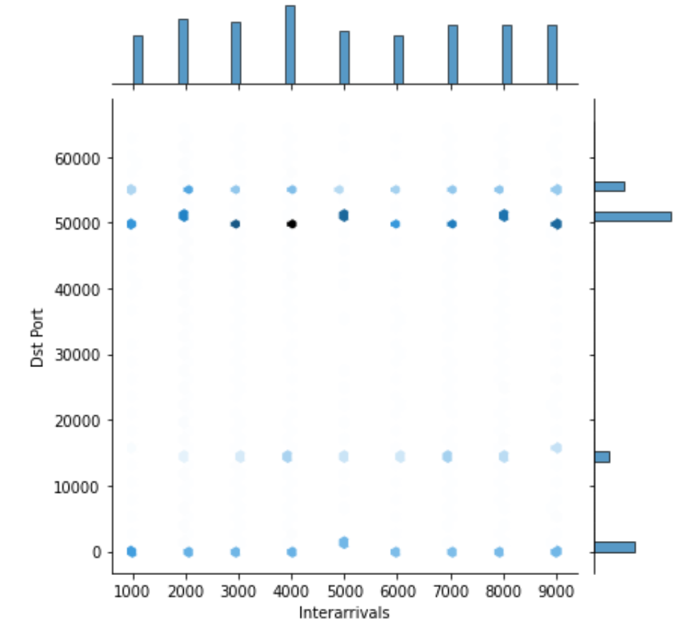 | 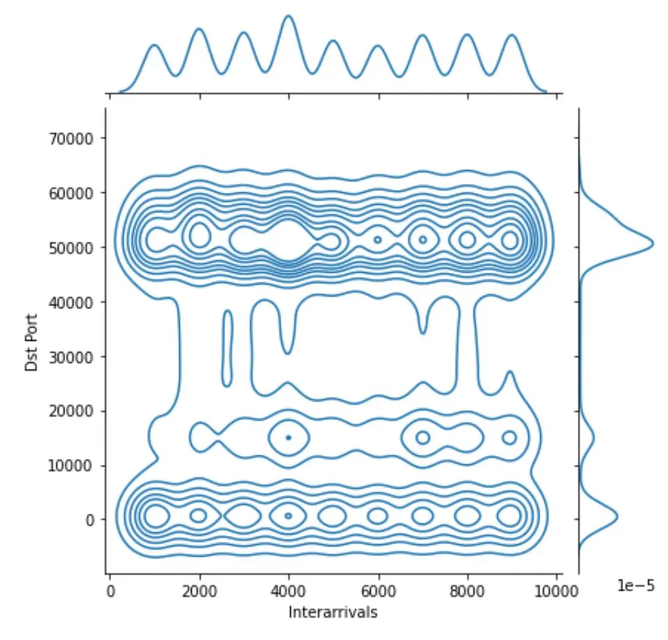 |
Note that we used the power of Pandas data frame to define a new frame short_intervals, where we take interarrivals that are less than 10K nanoseconds. The hex type plot resembles a scatter plot with histograms on the sides. The color coding of the data points indicates higher concentration of values in this specific area. The kde (Kernel Distribution Estimate) gives a distribution similar to a histogram, however the centralizing values, i.e., kernels, are visualized as well. The three distinct parts of the graph in kde will be described with three different mathematical distributions.
Summary Statistics
Summary statistics as part of EDA are extremely useful when dealing with a large set of data:
short_interarrivals.describe()
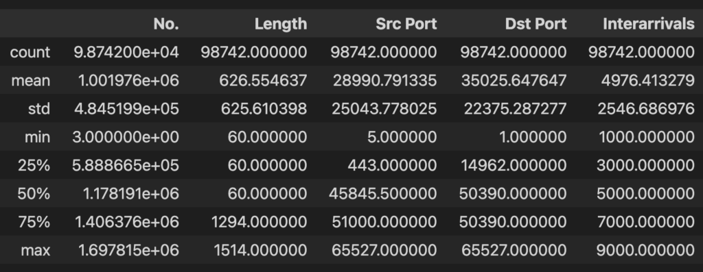
With a single line of code, the describe Pandas function gives us several statistics such as percentiles, min, max values, etc. These statistics can lead to distribution fitting and additional insights into the data.
Autocorrelation
Finally, autocorrelation calculations show how much the values within a series, i.e., the length or interarrival values, are related:
length_series = os_scan_data["Length"]
length_series.autocorr()
0.3938818297281779

interarrival_series = os_scan_data["Interarrivals"]
interarrival_series.autocorr()
-0.031230988268827732
In this case the packet lengths are positively correlated, which means that if a value is above average, the next value will likely be above average. Negative autocorrelation such as the one that is observed for packet interarrivals, means that if an interarrival is above average, the next interarrival will likely be below average. This is a powerful metric for predictions.
Conclusion
We have reviewed how to use EDA techniques to extract useful information from black-box data. This part of the series data analytics for Network Engineers, offers a deeper understanding of the power of the Pandas library and the statistical techniques that you can implement with it. In the last part of the series, we will review some predictive models. Stay tuned!
-Xenia
Resources
- GitHub repo with code examples.
- Part 1: Introduction to Pandas for Network Development
- Jupyter Notebooks for Development
Tags :
Contact Us to Learn More
Share details about yourself & someone from our team will reach out to you ASAP!
